Limited color palettes
A small palette is not a defect. It is the constraint that makes pixel art read as graphic instead of photographic. Pixelizer’s Max Colors control is that budget.
Retro pixel art looks like retro hardware because those machines could not spend many unique colors on a sprite or a tile. A 16-color set already feels like a late-80s console tile; 32 colors still read as graphic. Hundreds of colors start to look like a compressed photograph on a coarse grid.
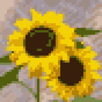
Pixelizer’s Max Colors control is a hard budget from 2 to 256. It is not a suggestion. Every quantizer — Median Cut, K-Means, NeuQuant, Octree — has to land inside that cap. The sunflowers above use 16 colors on a 44×44 grid with K-Means: yellows collapse into a few flats instead of a continuous bloom.
16 and 32Sixteen is a useful default when you want posterization without going two-tone. Thirty-two keeps extra ramps for skin, sky, or metal while still forcing decisions. Drop toward 8 or 4 when you want a stamp or a 1-bit-adjacent icon. Climb toward 64+ only when the grid is large enough that extra swatches do not turn back into noise.
After convert, recolor the extracted palette. Changing a swatch updates every cell that used it — faster than painting the same correction by hand. That is the studio step one-shot converters skip.
Dither, or don’tError diffusion and ordered (Bayer) dither can fake extra shades inside a tiny budget. Keep intensity low, or off, when you need clean sprite flats — see game sprites. Turn it on when a sky or a gradient bands too hard.
Engine choice still matters at the same color count. Read Median Cut vs K-Means vs NeuQuant vs Octree before you blame the budget.